

_TUSTY
a visual universe from scratch
_When the visual is the message
Some brands communicate through what they say.
TUSTY communicates through what you see. A pop visual universe with Japanese references, surreal and irreverent — where the power of language dispenses with excess information.
The challenge is not to explain the product — nor the flavor, nor the attributes. It is to create a world where all of that is already legible before any word.
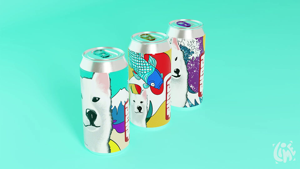
_Three states of the same universe
TUSTY is a conceptual, fictional brand project — which means a free starting point, without external briefing and total creative responsibility for each decision.
Each can has its own visual references, within the same universe, with a distinct palette, composition and cultural references, maintaining coherence through the common thread of the mascot — a white Shiba Inu.
Art direction defined not only what each can would look like, but how each universe would behave when it came out of the packaging — in campaigns, key visuals, and digital pieces.


Technique that changes. Direction that handles it all.
The visual system was created independently, blending illustration, 3D, generative AI, and motion design. But the tool was never the main attraction.
The point was to make everything work together: the can, the mascot, the campaign, the key visual, still images, and movement. Each technique was used where it made sense, without becoming a software demonstration or a showcase of new features.
At the end of the day, TUSTY needed to look like a real brand—even if it was invented. Or perhaps THAT was precisely the reason.